Course Savers case study
Enroll with confidence.
All your courses & costs in one place.
Easily see all the classes you’ll ever take, the tuition you’ll need, professor ratings and how much aid you have left all in one place.

Overview
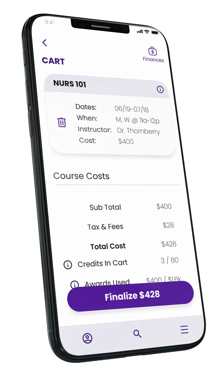
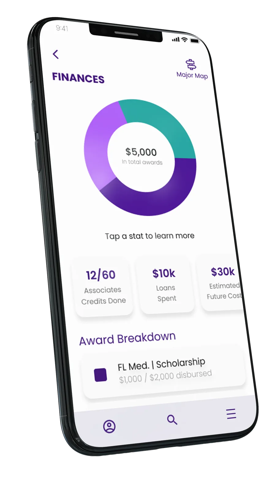
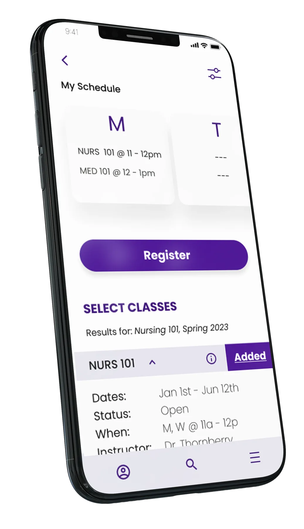
The Course Savers iOS app helps keep college costs transparent so that students can better manage their school loans and college debt. With help in class selection, budgeting and an app monitored, secured credit card, the Course Savers app helps students spend wiser.
Role
End to End UX

Duration
1 Month

Tools
Figma, Photoshop, & more



EMPATHY
User Interviews
User Research
Inispiration

DEFINE
Persona
Journey Map
IDEATE
User Flow
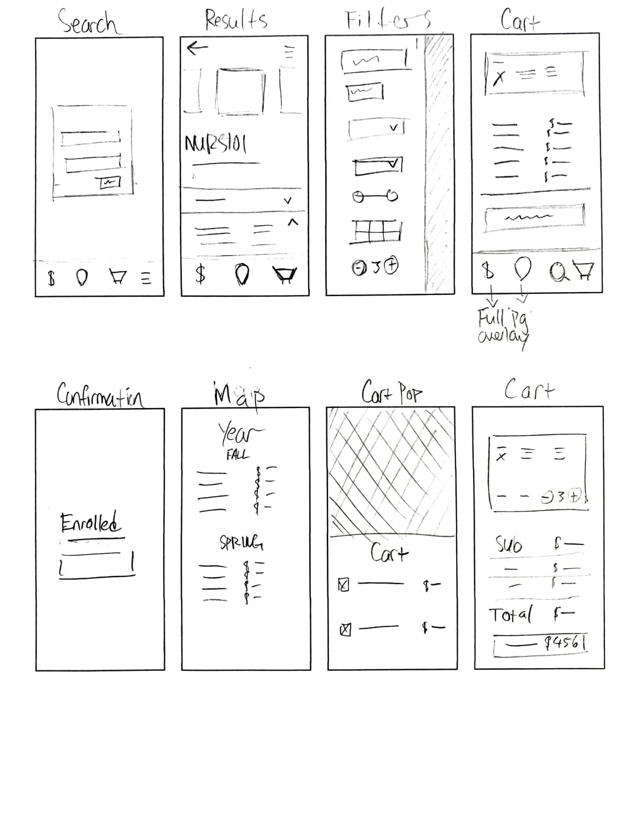
Sketches
PROTOTYPE
Accessibility ✓
Visual Design
Prototype
Wireframes
USER TEST
Usability Tests
Note Taking
Data Collection
Data Analysis
Iteration


5 STAGES OF DESIGN THINKING

The Problem
Student debt is stifling American graduates. And a considerable portion of student debt comes from students overborrowing and spending loan money on non-essentials such as expensive cars, clothes & brand new phones.










Research Methods
Interviews
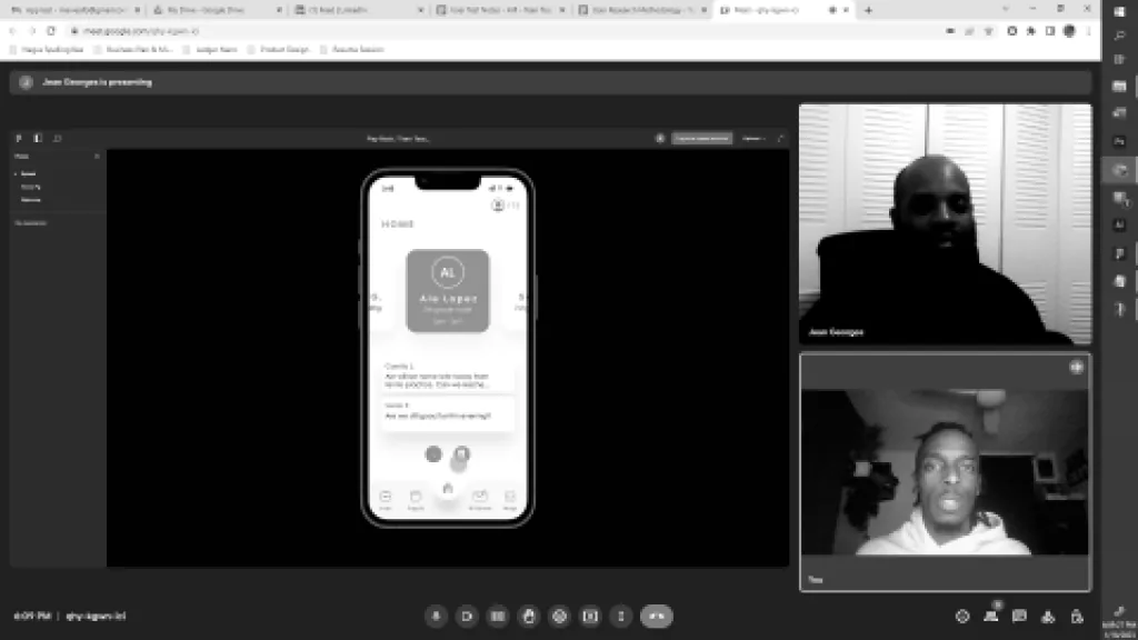
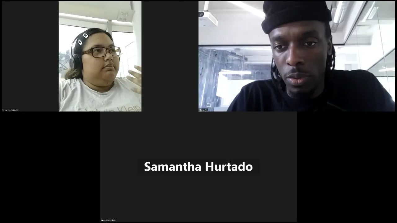
I interviewed 4 N. American college students ages 18 - 25, all either in school or 1 year graduated.

Secondary
I compiled supporting data from at least 5 different sources.

User Tests
I tested the mobile solution on 10 different users who fit the same interview criteria in person or on zoom.


*
In order to better understand the problem space, I needed to conduct research and learn more.


20 - 50%
of students enter college undecided, and up to 75% report having changed their major at least once.
69%
or more students do not know what the monthly amount will be on their first student loan bill.
$500 Bill.
in federal student loans is currently owed by borrowers ages 25 - 34.
$10k - $40k
is owed by most people age 25 - 34 years old.
55%
of students from public four-year institutions had student loans.
*
Rather than make assumptions, while researching, I found hard statistics that helped meidentify exactly who needs help & what they’re struggling with. This research will support most of my design decisions.



Interviews
Participants
- 4 People
- Ages 18 - 25
- In some debt
- Either in college or recently graduated within a year

Target User
Younger people hold the majority of student loan debt. They’re less financially experienced with lower paying careers. I believe helping this population would have the greatest impact.

Interview goals
- Understand student college experience
- Learn why students take loans
- Learn student financial responsibilities
- Learn how they spend their loans
*
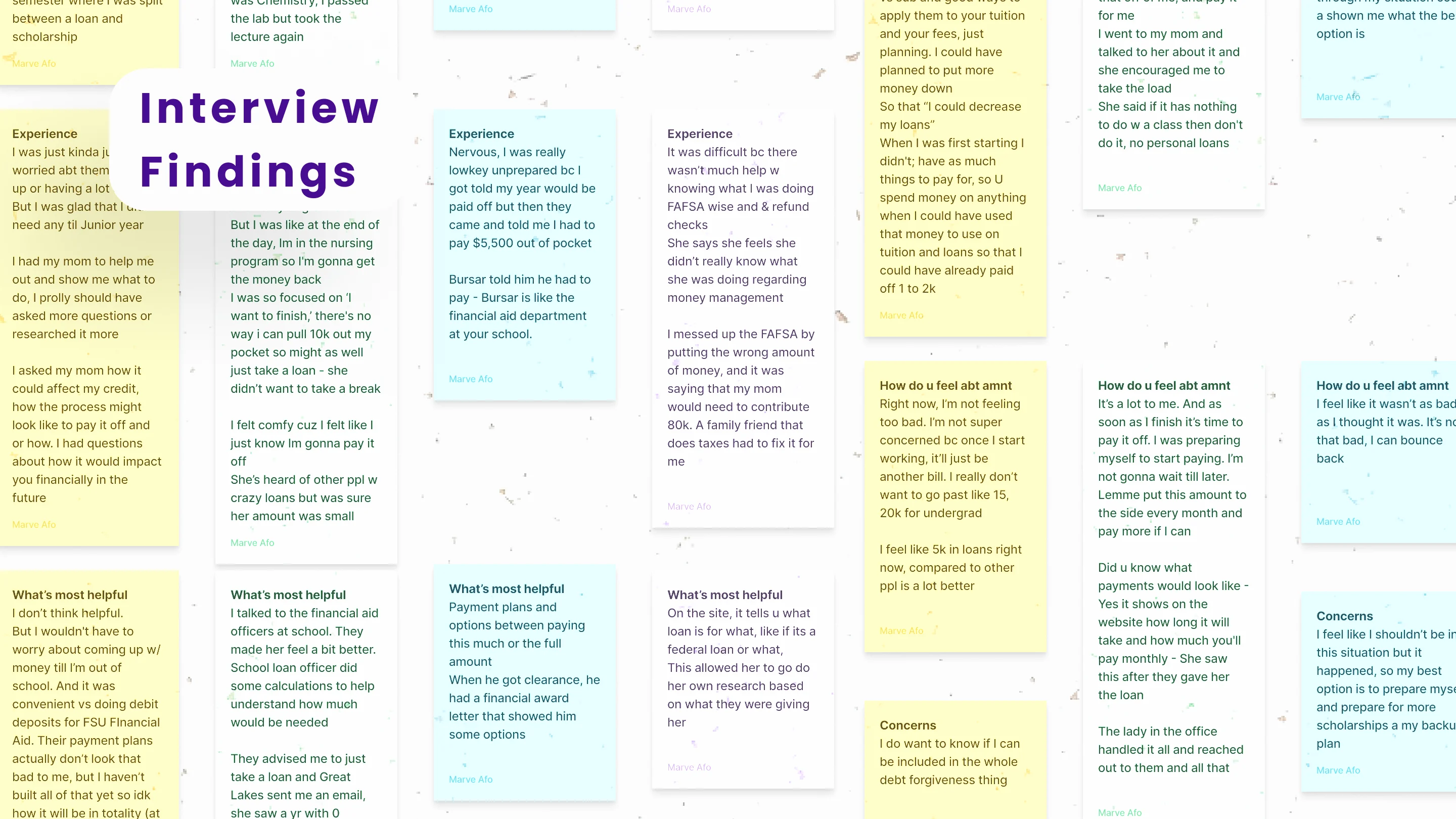
I couldn’t trust internet stats alone. I needed to interview actual students to check for correlation.

I asked open questions like:
- What was your experience like when you were making decisions about loans?
- What kind of support would have been helpful to you when you were making decisions about taking out loans for college?
- How did you feel about the amount of debt you incurred from taking out student loans?


Sam
Communication, FIU
Age: 18 Years
Loans: $1k

Morenike
Criminology, FSU
Age: 21 Years
Loans: $5k

Xavier
Psychology, FIU
Age: 20 Years
Loans: $15k

Shayo
Nursing, MRU
Age: 25 Years
Loans: 25k



Participants

Interview
Findings
Students need guidance with course selection and loan strategy
The costs of current and future courses is not transparent
Students were met with tough, unforeseen circumstances
Students felt uncertain angst about their loans
Pain Points
Out of 4 interviews over 100 notes, I heard a few common themes within student grievances. 3/4 interviewed, mentioned the desire for some type of map that would show them all their necessary future courses and their costs.
Concerned
*
In addition, with interview insights, I documented the student enrollment & spending experience. This visual, helped me find more specific pain points & brainstorm fixes or app features that could help students spend less for school.
- Check on aid status
- Discuss required courses
- View course map
- Plan classes to take for the semester
- Sign payment contract
- Select Term
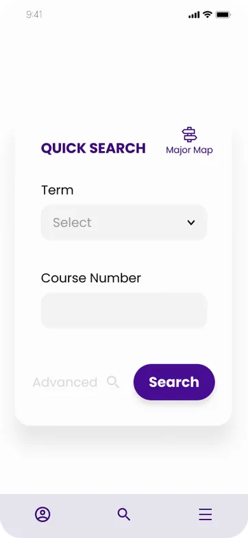
- Search page / Advanced
- Search results
- Click “select” on a class to single out
- Click next to add to cart
- View editable cart
- View finalized check out
- Click Finish Enrolling
- If award is received
- Visit financial page to check award and disbursement for classes
- Or visit financial office & bursar to make payments in person
- Attend class or view syllabus for books
- Search online or visit bookstore
- Use awarded money to buy books
- Save remainder refund check or spend on personal expenses
- Advisor chat feature
- Show full course map / plan to choose from
- Show class prices
- Filter feature
- A feature to add award info and amounts
- Add loan tracker to help students figure how much they have and need remaining
Lost
Overwhelmed
Accomplished

TASK
FIX
FEELING
ENROLL & PAY
BUY SUPPLIES
SELECT COURSES
VISIT ADVISOR
JOURNEY - COLLEGE STUDENT REGISTRATION



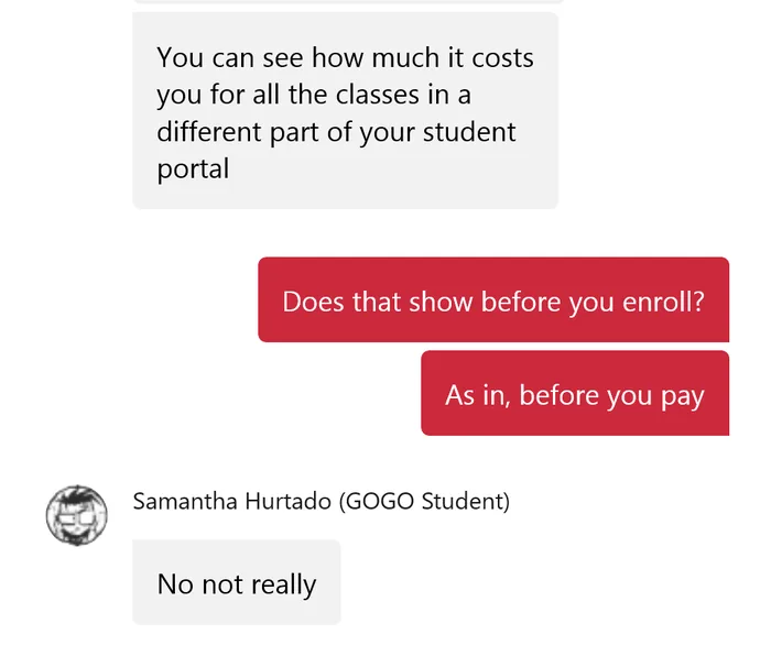
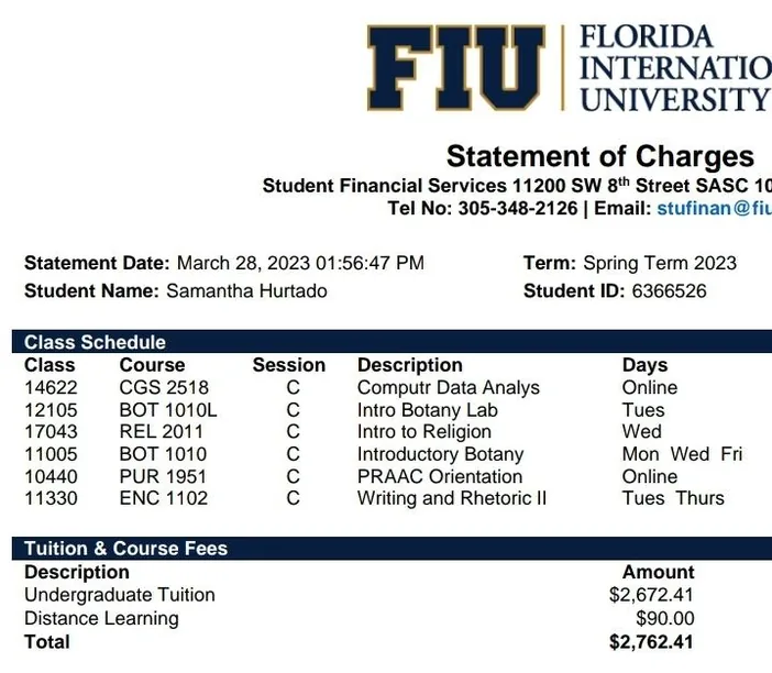
- Florida International University
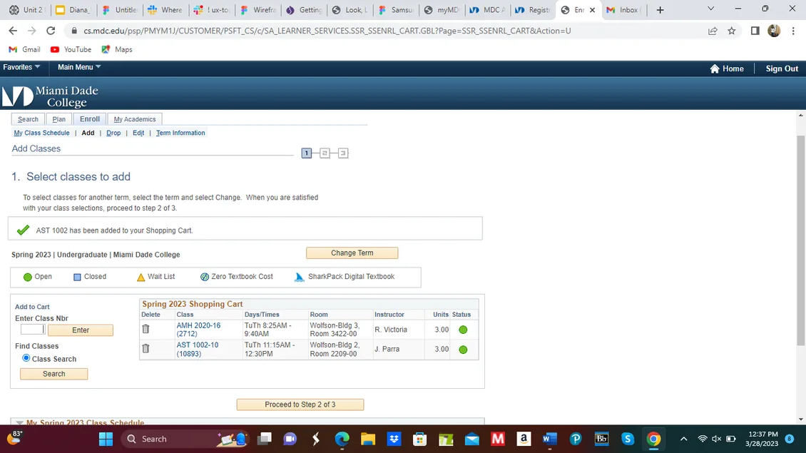
- Miami Dade College
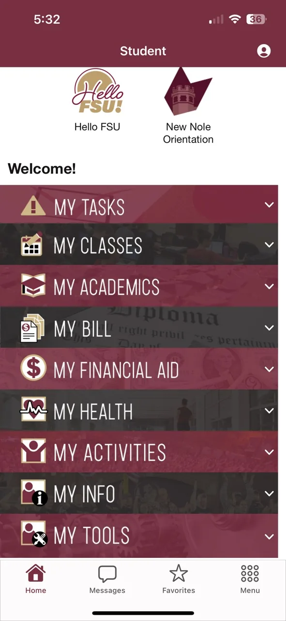
- Florida State University
College
Interface
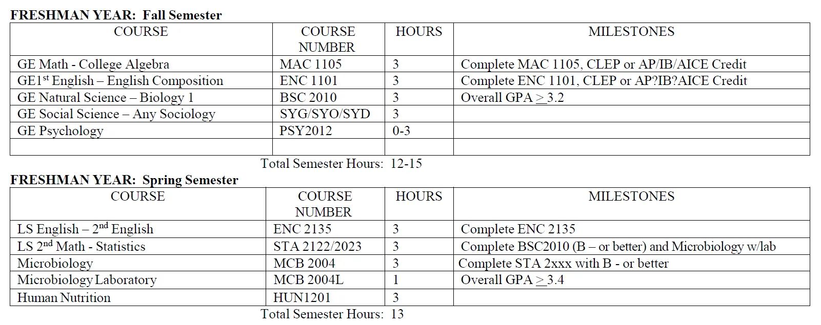
To learn how to make the student journey smoother,I asked interviewees at major institutions to walk me through their student portals.
Here’s what I found:
- Costs are not detailed.
- Course pickers are long outdated.
- Info like financial aid balance & courses to pay for next are in 2 separate places.It’s like a grocery list vs. an Amazon baby registry. One shows you everything you need + the costs and who to buy from all in 1 place.
- The academic map is not interactive & does not show course history.

Jayden P.
Quote
“I only have to take a loan because I need to pay for 1 class I need to make up.”
Frustrations
- Academic path and costs are not clear enough
- Taking too much loans
- The effect of loans on his credit
- Whether he chose the right major
About
Age: 21
Job: Nursing Student
Where: Uni. of Miami
Bio
Jayden struggled learning 200+ bones in Human Anatomy. His scholarship won’t cover the cost for a retake. He didn’t expect to ever take any loans. Now he’s trying to find the best way to go about his next college semester.
Goals
- Graduate & find work
- Take as few loans as possible
- Transparency in loans
- Layout of all courses & loans
- Meeting with a reliable admissions & financial advisors
Persona
With collected & organized interview data, I knew what the student struggle looked like. I also knew what the enrollment process looked like. All I was missing was an image of the student.
Jayden is a culmination of the average indebted college student’s frustrations, motives & daily life. He helped me focus my design for a target user.
How might we*
make college costs more transparent in order to help students like Jayden plan their college career finances more efficiently?

Hypothesis
If I can help students see all their future courses, costs & spending habits, they may better mange their resources & spend less borrowed money.

*
Jayden and students alike have a need for a particular feature. I have to ask myself, how do I best fulfill that?

User Story
As a college student, I want to view all my courses and their costs at once, so I can plan exactly how much money to borrow when I enroll.





*
Based on my hypothesis, I crafted a user story for Jayden to explain what kind of a solution he needs. This further narrows down the design solution’s focus & scope.




Applyfor aid

1


Funds
Settle

2

Use app to find classes
3

Deposit Extra Funds
4
Order of Operations
Saver Card
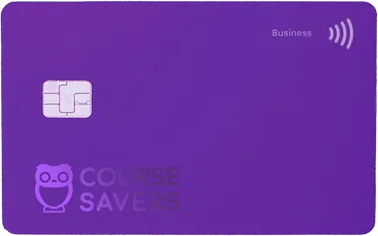
After students pay for classes, any extra aid money is sent to them as a refund check. This money could be deposited on a secured credit card that is restricted to food, gas and campus purchases. The credit card would be monitored by the Course Savers app, allowing students to track their spending & safely build credit for their post college lives.
PERSONAL
Tap a stat to learn more
620
Credit Score
30
Card Swipes
$453
Average
Spend
$50
Dollars
Saved
Monthly Spend
Groceries
$100 more than last month
Subscriptions
$0 more than last month
Gas Tank
$20 less than last month

Major Map




9:41
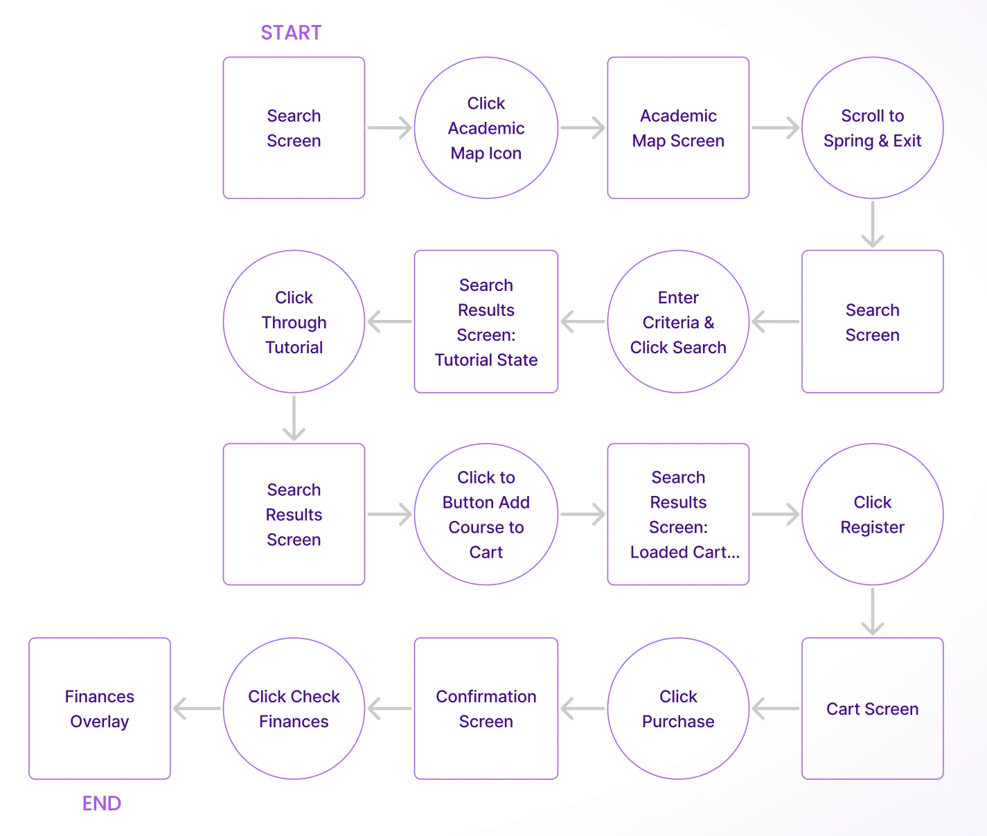
Task Flow
STEPS
- Check academic map
- Search for class
- Register & pay
- Check finances
- Check for failing grades
START
END

*
Considering the challenges of the typical college enrollment journey, I began to imagine what helpful features might look like from screen to screen.
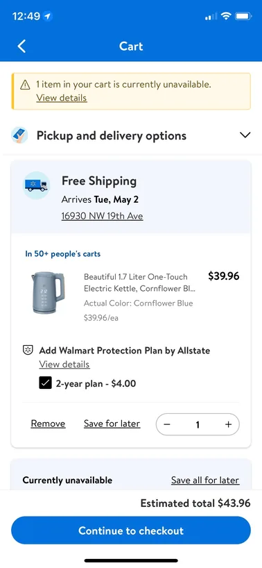
I favor modern rounded corner on CTA buttons.
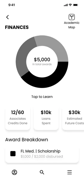
I’ll need circular graphs to demonstrate student loan amounts.
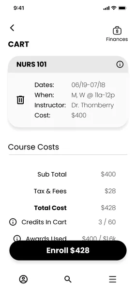
This trash can is more indicative of “remove from cart” than an “X” icon.
Data organized in floating blocks.
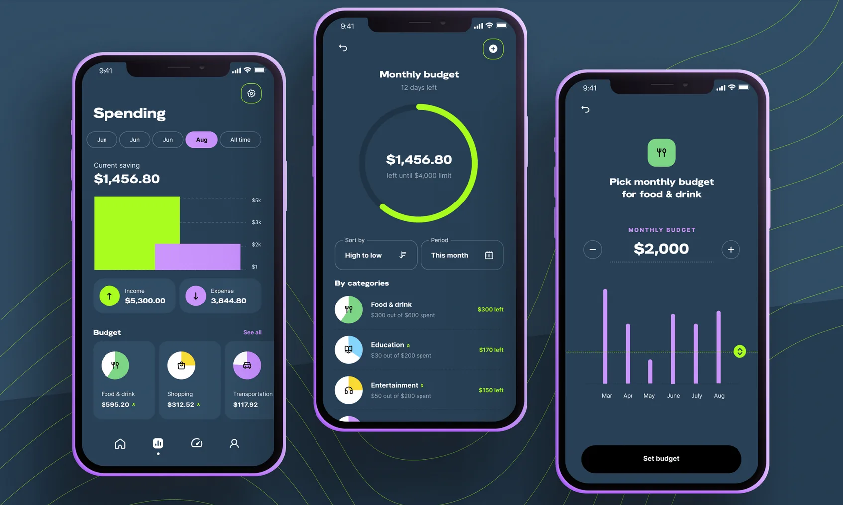
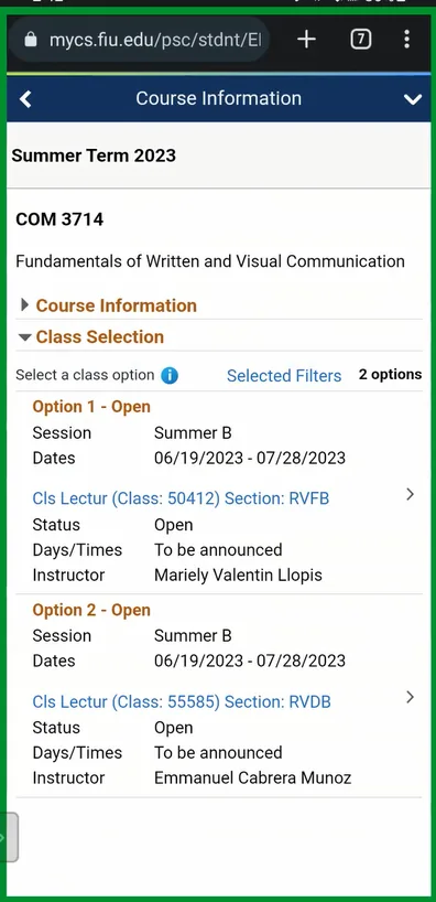
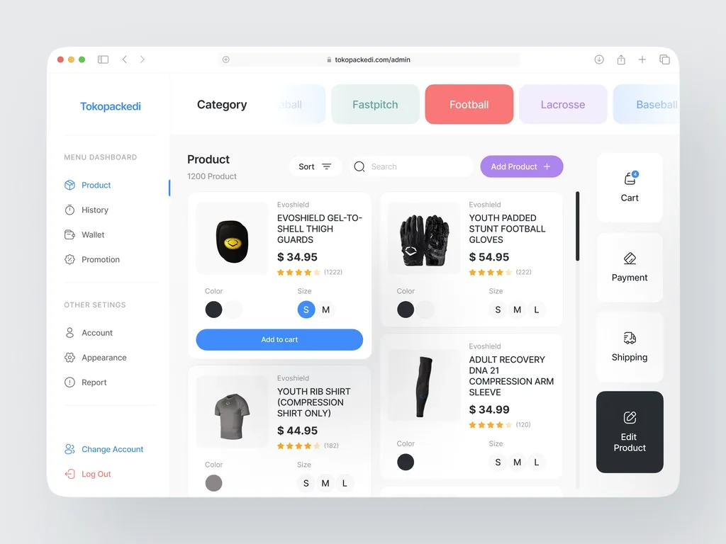
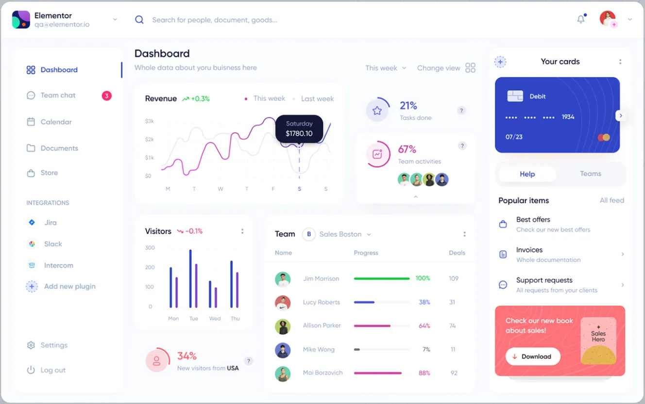
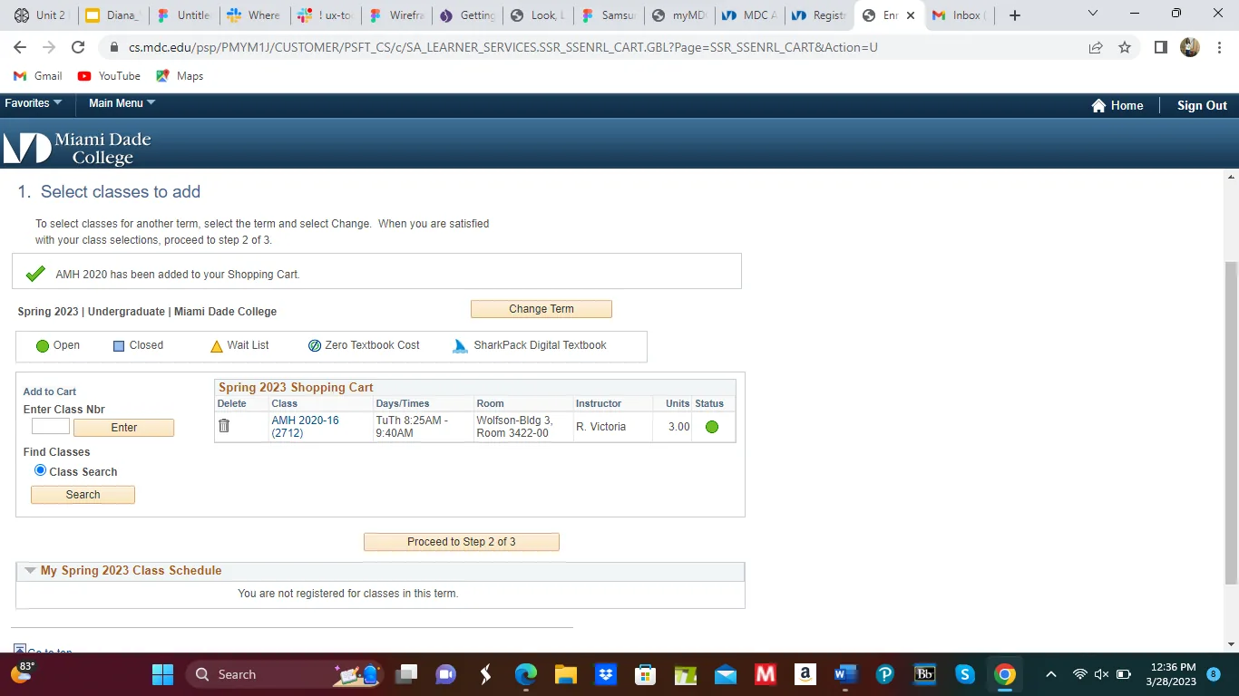
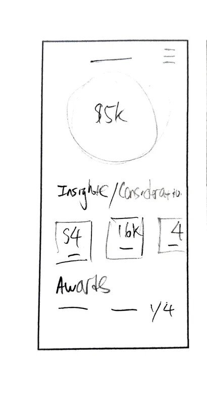
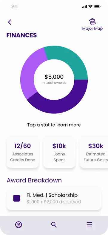
Circular graphs aligned with cards below would be a good format to display financial info on a mobile device.
The Walmart checkout process is one of he cleanest ecommerce experience I’ve ever seen for users.
UI Inspiration
With a potential task flow in mind, I searched the app market & the apps of 4 major institutions for already existing solutions to borrow inspiration from.

Drafting
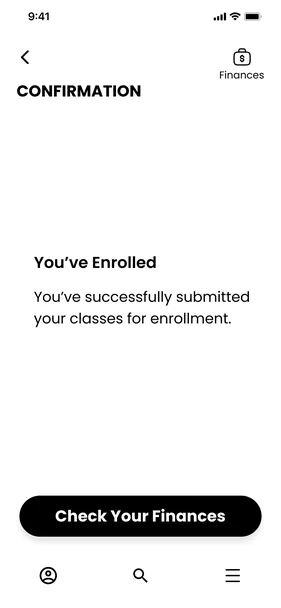
I drafted about 20 sketches to try & visualize the potential task flow I created. The prior inspirational research helped a lot with this. I chose the drawn ideas that looked most usable & digitized them in an interactive prototype.


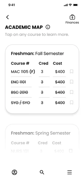
Academic Map
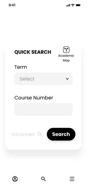
Search
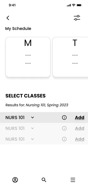
Results
Check Out
Confirmation
Finances



User Tests
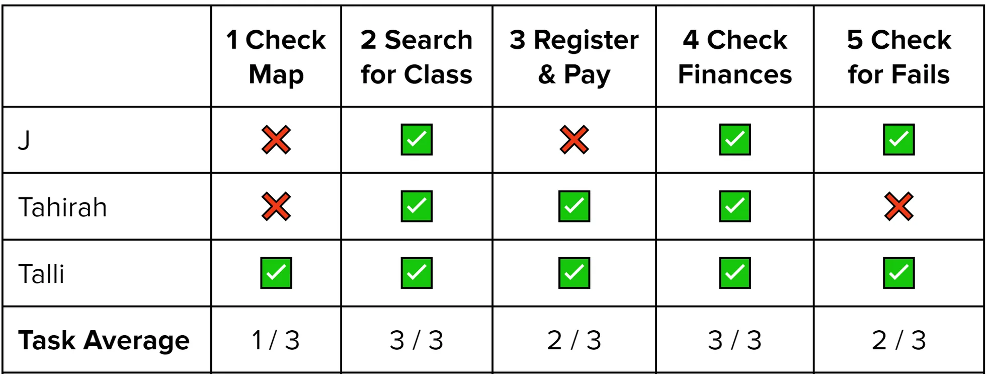
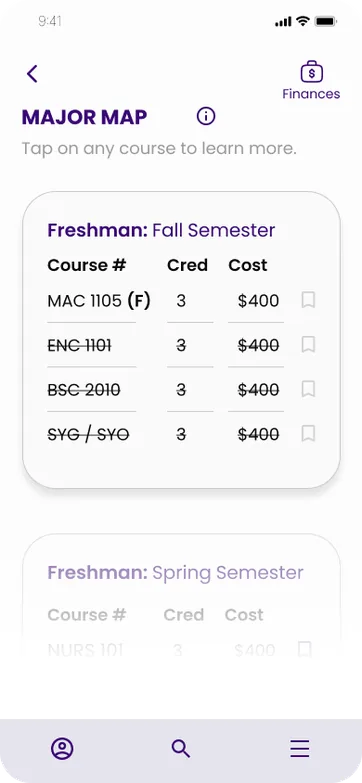
- Users confused by strikethrough text
- Users confused by a few financial terms
- Users say “Academic Map” icon looks like a physical map
- Users didn’t recognize function of cart icon
- Users skipped class selection
- X - Failed Task
- ✓ - User Success
*
After the prototype was completed, I did 2 rounds of testing between 10 users who fit the specs of the target user. I’ve provided a sample of findings from 3 out of the 10 people tested.


EFFORT
USER
VALUE
High
High
Low
Low
Users don’t recognize function of cart icon
Users confused by strikethrough text
Academic Map icon is misleading
Users skip class select
User didn’t understand many financial terms





Priorities
What to Fix First?
Looking at test results, I used this matrix to rank the biggest but easiest problems.
- P0 - Users don’t recognize function of cart icon
- P1 - Users unfamiliar with financial terms
- P2 - Users confused by strikethrough text
- P3 - Academic Map Icon is misleading
- P4 - Users skipped class selection
P0 - Though the cart icon may be the hardest to fix, it is given high priority because it could prevent users from completing the task of registering for courses altogether.
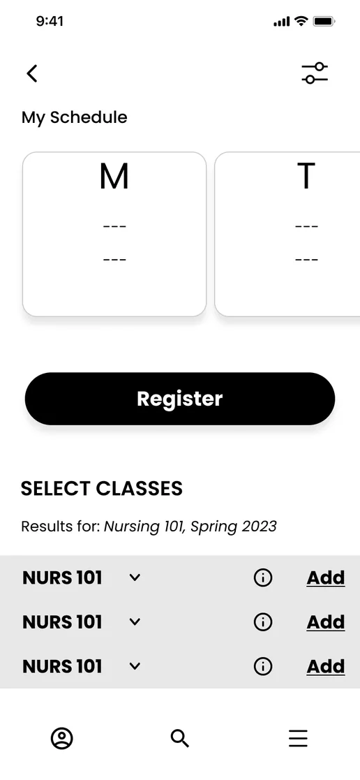
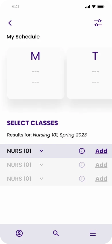
Hidden Button
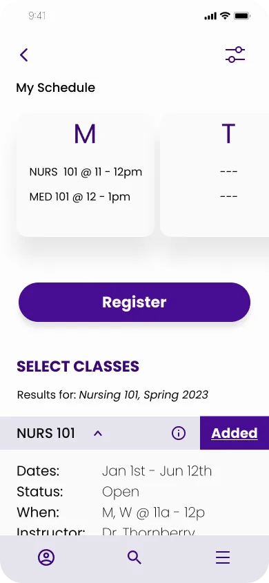
Between mobile V1 & V3, the register button was made to be hidden until a course is actually selected so that users don’t skip steps.


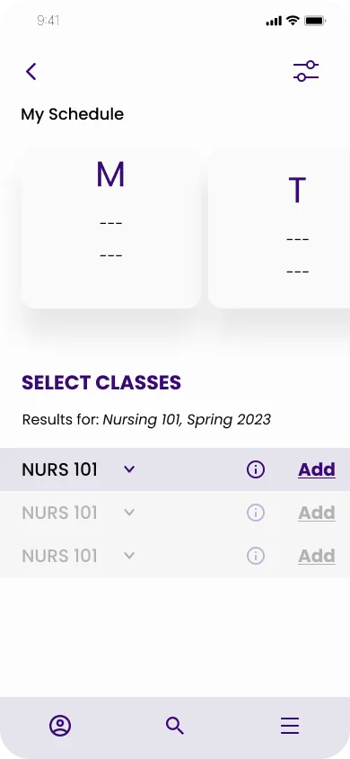
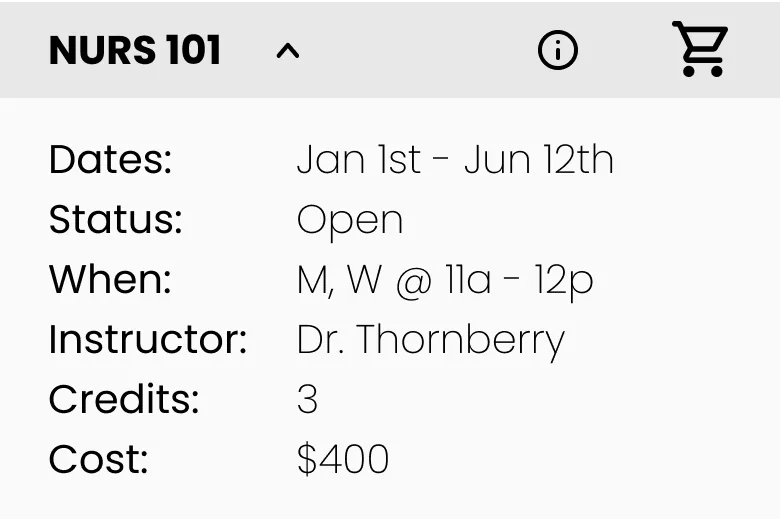
Ambiguous Cart
V1 originally had a shopping cart icon to add courses. But the 1st user overlooking it quickly proved how that may have been too ambiguous. The clear message, “Add,” was used instead.
Before

Before
After
After

*
After each round of testing, I made changes to improve the app’s usability for students. V1 & V2 include the gray mid-fi wireframes. To the right of each image is the V3 hi-fi, final update with a bit more color.
Changes

P0
P4
Changes
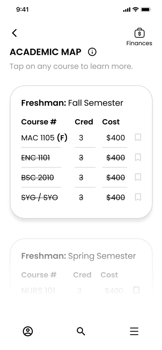
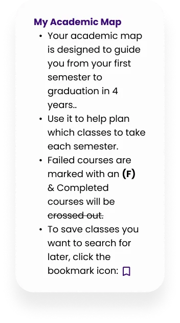


Unclear Signifier
Users were confused by strikethrough text. I added an info pop up to explain things. I did the with tappable, pop up finance terms.
After
After
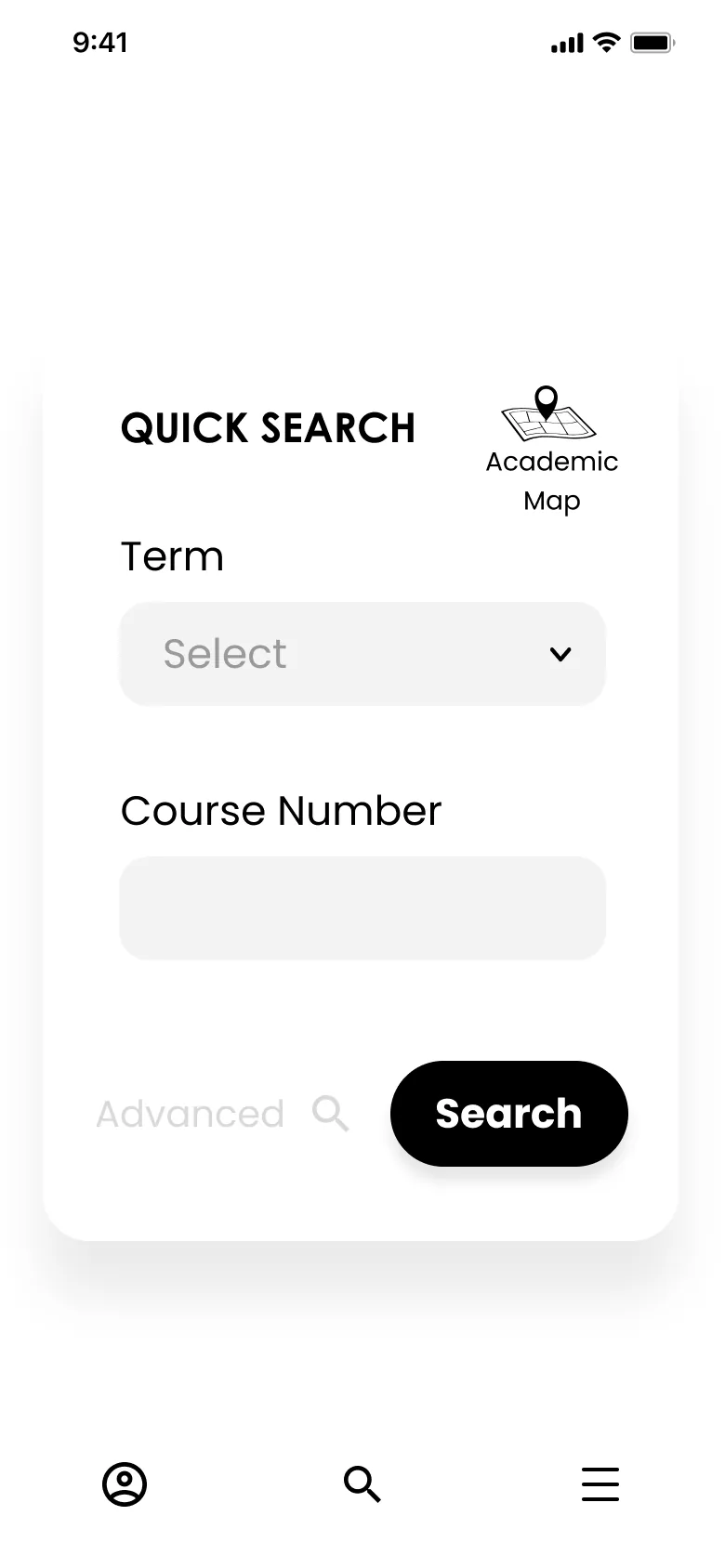

Ambiguous Map
3 / 3 users on the last test mentioned that the academic map icon made them expect a physical map. So I found an icon less GPS like represent a “path” instead and also changed the name to “major map” through all titles and pages in the app to be more specific.
Before
Before
P1
P2
P3
White Neutral
Backgrounds
Header Backgrounds
& Nav Bar
Main
Interaction
Color
Titles
& Icons
60%
30%
10%


30 | 60 | 10
Among the changes made in the hi-fi V3 wireframes, there was color. The app’s main brand color is purple with the intent of offering users calm, like evening skies. White & gray are neutral backgrounds & a dark purple is used for contrast in text and interactive icons.
A bit brighter purple is used as a sort of soft pop & additional interactive color.
#E5E4ED
#390A75
#470D92
POP
COLOR
INTERACT
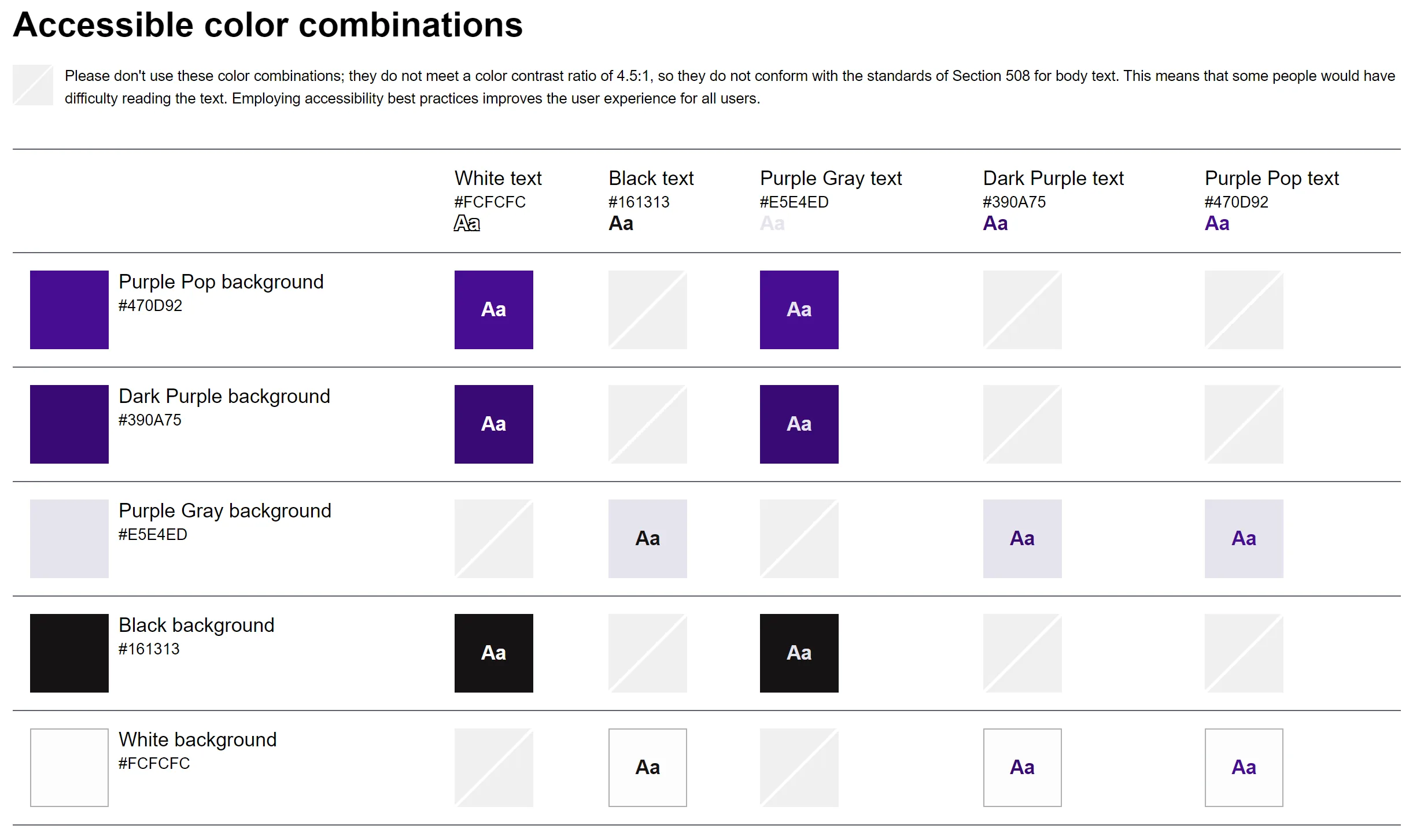
A11y
I plugged those main 3 colors into an accessibility checker on Github to see what color combinations would be comfortably visible to everyone’s eyes. This guided my color injections to make sure every element in the app remained visually accessible for all.
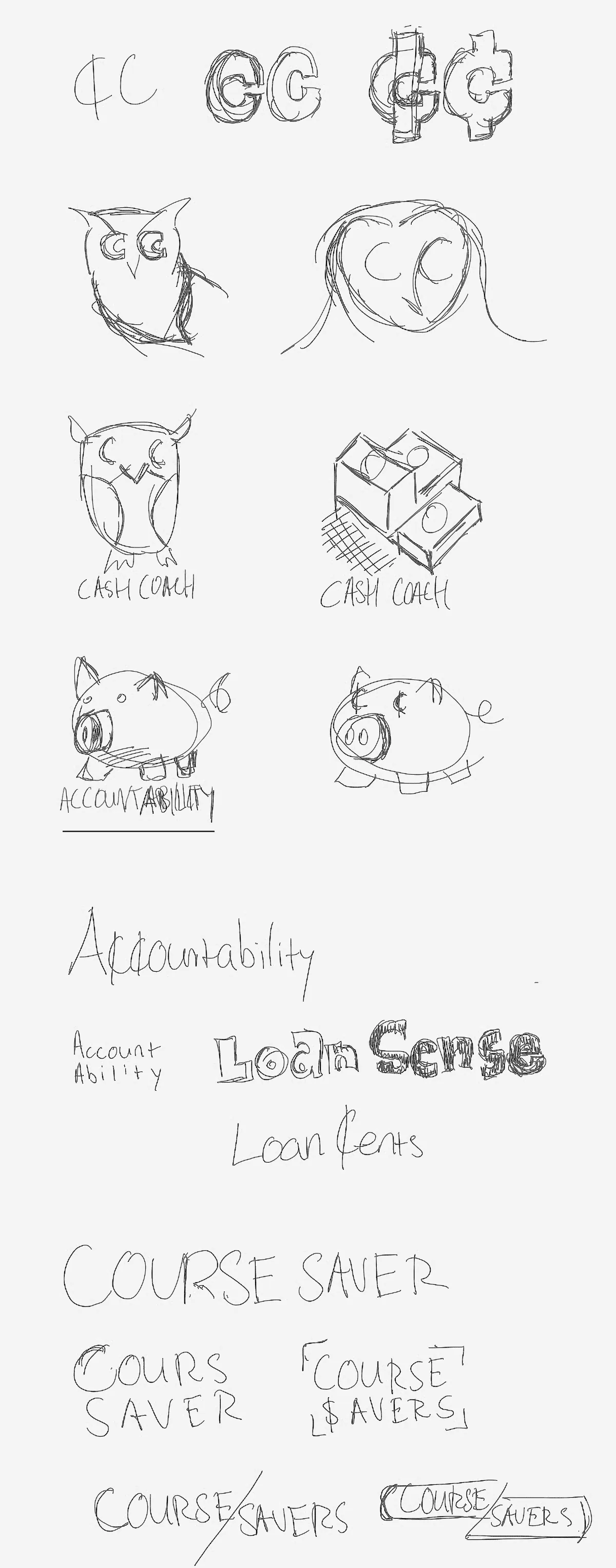
App Logo
Once final colors were selected, I played with potential app names, icons and logos.
The name “Course Saver” felt best:
- It could save students money.
- The app helps students save course searches while enrolling.
- The app easily provides students with a full 4 year academic map, so students may be saved from taking courses unnecessary for their major.
- The owl represents wise choices.


Brand Logo
Here you can see where I came up with a digital representation for a few of my sketches, combining the chosen word mark with vector art owls, piggy banks, dollar signs rather than cents and even a book or road sign to represent student guidance.
The full bodied owl encased in a purple stroke was the final choice for the app icon. Paired with the stacked word mark, they make a complete logo for the Course Savers app.
COURSE
SAVERS

COURSE
SAVERS

COURSE
SAVERS

COURSE
SAVERS

COURSE
SAVERS

COURSE
SAVERS



Enroll with confidence.
All your courses & costs in one place.
Easily see all the classes you’ll ever take, the tuition you’ll need, professor ratings and how much aid you have left all in one place.

Download from
App Store

Download from
Google Play
Landing Page
1 of my last steps was to build a landing page for the Course Savers App. The branding of the completed app concept can be seen in full effect here. This site can help to boost traffic, user count and downloads for the Course Savers app.
Home
About
Contact
Download Now

Responsive Desktop

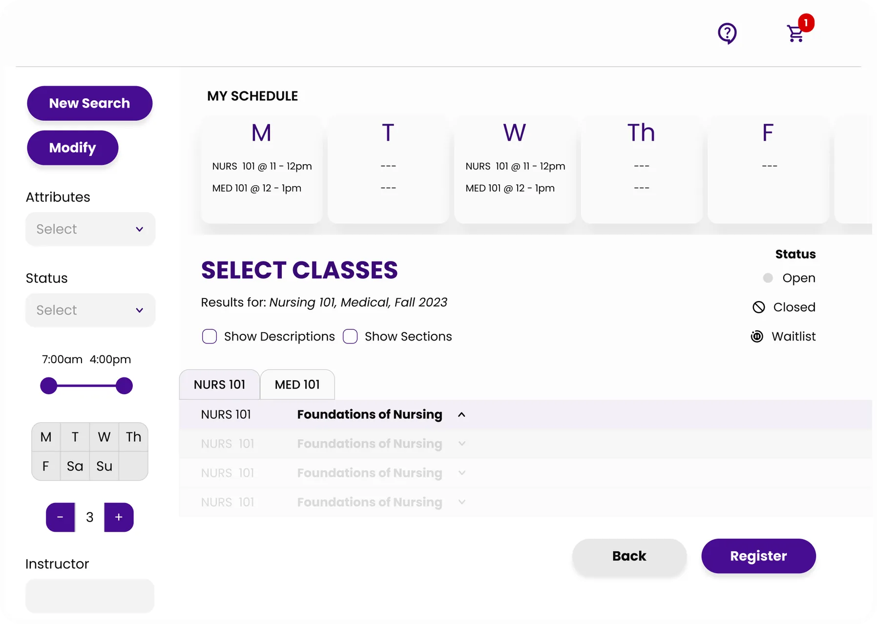
Desktop Version
Additionally, a desktop version of the Course Savers app was also designed so that students would be able to see a lot more of their search filters, schedule and selected courses at once. This includes the ability to open multiple search tabs.
Users Love It
- It feels like for once, the school is not trying to dupe you into spending more money than you actually need.- Sam | User Tester
- Yo… that’s dope to be able to see how much you have to pay back vs. how much you’ve taken, that would make people so diligent when it comes to student loans.- Jay | User Tester
- This all looked pretty similar to how I would register, [but] they didn't have a whole map of what I need to take. I had to look at [a] paper then the screen, then the paper, then the screen...- Diana | User Tester
- “I personally would ... use this, to be honest with you” because I have to go to my advisors a lot when I could just have it here.- Xavier | User Tester

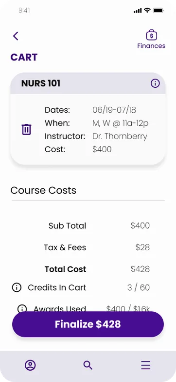
Impact
Course Savers could...
- help schools sell a more convenient & modern registration experience.
- lower spending on advisor and financial bursar staff.
- lower dropout rates by offering mobile guidance.
- lessen the amount of student non-essential spending.
- save students from predatory credit card lenders.
- help students build credit safely.
Key Learnings
- Colleges often have semi hidden costs. (NYT)
- Be careful with ambiguous icons.
- Progressive disclosure aids comprehension.
- A user story is kind of like a product feature. & an epic encases several of those features.
- Components may detach when copied across Figma pages.
- Make all text styles before typography scale.
- Redlining is tedious. Plan accordingly.
- 1920 x 1080 doesn’t fit perfectly into the Figma Macbook device presets.
Next Steps
- More user testing & research
- Add debit card / budgeting features
- Responsive design for web
- Decide whether this will be 3rd partyor in partnership with schools.





Marve Afo
MarvinAfo@Gmail
MarveAfo.com
@MarveAfo



Keep in touch.